DESIGNING TRADIES JOB MANAGEMENT SYSTEM

Two-sided cross platform customer and tradies system

Sector

Trades

Challenge

Very limited budget, resources and time to build complex system

My Role

Product / UX UI Design, Research and Analysis, System Design, App Design, Web Design, Information Architect and User Testing

Project Time

Approximately one and half years

TasksTech
TRADIES JOB MANAGEMENT SYSTEM MVP PROJECT

INTEGRATING TRADIES JOB DETAILS

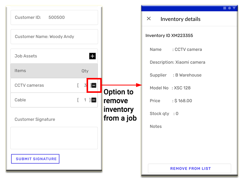
From our user/client story, we found out that tradies keep their job-related notes in their mobile’s calendar and they have to find the notes manually which make it difficult for them to keep track of their jobs.

Therefore, this pain creates a potential demand for a two-sided platform system that helps tradies easily access, record and keep track of their booked jobs, and helps customers to keep track of their jobs.

THE CHALLENGE

Complex system with three developers and one UX UI Designer.

From our client, who is also our target user (tradie), we found the fact that tradies keep their job-related notes in their mobile’s calendar or somewhere in their mobile. And they have to find the notes manually which make it difficult for them to keep track of their jobs.

This MVP app/web has very limited budget, time and resources as its constraints.

From my personal experience, tradies job and inventory management system are one of the most complex systems that often involve multiple site visits and multiple materials to complete a complex job/project, and complex quotation process before the deal is accepted by both customer and tradie.

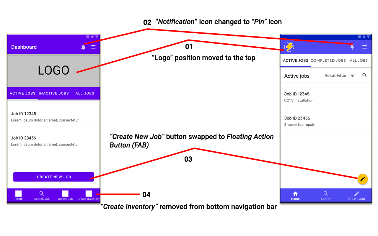
On the other hand, the technical challenges that I face while working in this project are some interaction designs in my prototypes are not able to be reflected by Figma software. Some examples are as following:

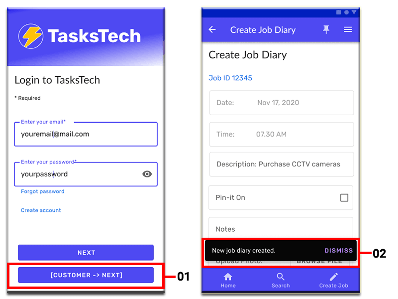
  1. Figma prototypes, they need two “Next” buttons in the Login page to simulate the real app/web properly by taking users to the relevant dashboard page based on which category the user falls into–tradies to tradies’s dashboard and customer to customer’s dashboard. While in real app/web, it doesn't have this issue. The codes will easily read the user type from user's login details, thus only one “Next” button will do the work.
  2. Snackbars that appear on screen should automatically disappear from the screen after ten seconds, to create the effect, I created identical screens but without the snackbar in the second screen.
TasksTechPrototypingLimit

MY ROLE

I am the sole UX UI Designer and led the entire product and system design from September 2020. Then at the later stage (November 2020), a Business Development Consultant assists me with design and testing.

Soon after Android prototypes were completed by me and approved by client, we began the development. At the same time, I started building Desktop prototype.

In January 2021 the desktop prototype was completed then passed to development team to begin the development of MVP through the collaborating with a Business Analyst (who is also doubled as a Front-End Developer), a Front-End Developer, a Back-End Developer and a Project Leader.


THE APPROACH

FOCUSING ON MAIN PRIMARY OBJECTIVES

Our client approached us with the main primary objectives – helps tradies easily keep track of their jobs, while in the future, we’d like to expand the scope to the online marketplace platform where tradies and customers meet online in TasksTech and agree on the job through quotation processes that happen in the platform.

Team collaboration with Lean and Agile UX approach
We opted for Lean UX- rapid sketching, prototyping, user feedback and design mockups whiledelivering requirements iteratively and incrementally.

Build and deploy it cross platform
We have first triedout Quasar for tutorial project then team decided to build our MVP using Quasar framework- Android, Windows desktop, iOS, Mac platforms.

Continuous connected and collaborate
Virtual online meetings and Slack team-collaboration with key stakeholders throughout the design and development of MVP.  We also collaborate through github Kanban-style. 

img\TasksTech\githubOverview.svg


KICKOFF

PLANNING AND ANALYSIS

GATHERING DATA - BUSINESS AND USER REQUIREMENTS

We had an initial meeting with client, interviewing client and user, defining our MVP goals. Our MVP will be cross-platform, development by using Quasar with first deliverable in Android then Windows desktop web platform, and deliverables will be broken down into two main stages:

  1. “Note-taking” flow
  2. “Online marketplace” flow (future)

In this phase, we have also performed the following:


User Personas

We’re able to identify four main user personas from these activities, they are:

  1. Tradie who offers the service, for example:  electrician, plumber
  2. Business owner (customer) who's looking for the service, for example:  KFC Beverly Hills
  3. Individual customer who's looking for the service, for example:  home owner, landlord
  4. System Admin who has full access rights to the system (future)
SystemOverviewDiagram_StoryBoard
UserPersona.svg
UserStories.svg
AppWebElement.svg
SiteMap.svg
AppFlow.svg

Visual Research and Style Guide

Figma Material Baseline Design Kit (Community) Kits  are used with some customisations to fit TasksTech - not only considering that UI Quasar framework is based on Material Baseline Design, but due to time constraints and limited resources in design department. 

As for the colour theme, I use https://material.io UI Colour Palette to generate the colour themes.

Prior to that, some colour theme sets were presented to key stakeholders to choose from. Using the chosen colour theme, TasksTech colour theme is generated with minor customisation.

On the other hand, visual research (colour, typography, graphic styling, web and device design) and style guide references are taken into consideration to adjust and customise Material Design Kits to fit TasksTech's style and requirements.

VisualResearch.svg
VisualResearch_Design.svg
MaterialDesign.svg

DESIGN

PROTOTYPING

PAPER PROTOTYPING

As the simplest form of prototyping, I started the prototyping process with paper prototyping. It is the quick way for me to generate the digital ideas by sketching on the paper, visually and evaluate them with my team and with our target users.It allows me to see the system flow and system map easily from high level to low level. 

WIREFRAMING

The team decided to start with Android and desktop platforms at initial stage then iOS and Mac platforms at later stage:

  1. Mobile Android app
  2. Desktop web
  3. Mobile iOS app (future)
  4. Mac web (future)

Mobile Android App

I started the Android app design process with sketching the prototypes in paper, then presented it to the client for approval before building the wireframes in Figma. 
Upon the completion, I immediately conducted usability user testing then getting approval from the client. 
Once approved, I made some minor changes based on user testing's results since the client is happy with my wireframes and user testing was going really well with positive feedback from users.

Desktop Web

With the positive results from key stakeholders, I then moved to the next stage, which is building Lo-Fi prototypes and testing the prototypes.  
Finally, Hi-Fi prototypes were built based on Lo-Fi prototypes - initially, the team decided to build the Hi-Fi prototype straight into Quasar in order to speed up the process, however, considering that Mobile Hi-Fi prototypes are needed to build the Desktop prototypes, I built the Mobile Hi-Fi prototypes in Figma.

PaperProto.svg

PROTOTYPING PROCESS

What are those factors that have been taken into considerations and thus shape the current prototypes?

Tradie's Dashboard

  1. "Company Logo" position moved to top, appears on each screen and serves as home navigation link to dashboard page.
  2. "Notification" icon changed to "Pin" icon to avoid confusion. 
  3. "Create New Job" button swapped to Floating Action Button (FAB)  as it performs the primary, or most common, action on a screen.   
  4. "Create New Inventory" button removed from the bottom navigation bar, as it already exists in the navigation drawer.
    Using a navigation drawer with other primary navigation components, such as a bottom navigation bar, should be avoided. 

TasksTechTradieDashboard.png

Navigation Drawer

Following Material Design's guidelines - avoid using a navigation drawer with other primary navigation components, such as a bottom navigation bar - I removed the "Create New Job" in the navigation drawer as it already exists in the dashboard screen as FAB.

NavDrawer.png

View Job Diary

"Notification On" removed from drop-down, and "Pin" icon is used instead. In addition to instant-change to yellow colour if it's activated or in an active state.

ViewJobDiary.png

Create Job Diary

  1. "Cancel" button style changed from contained button to outlined button.
    Reason: it's not the primary action in the app and represents a lower emphasis alternative to contained buttons - the "Create" button.
  2. "Date & Time" are auto-generated by the system as Date & Time stamp, no input from the user is required. 

CreateJobDiary.png

Create New Job

  1. Step by step - Step 1/3, Step 2/3 and Step 3/3 - to guide users on what is required to complete the new job creation process, number of steps in total and how far the user is to the end process.
  2. Background colour highlighted and "Completed" icon to indicate the Step 1 is completed and the user is currently at Step 2. Step 3 card is disabled and dialog is not provided to action on it.

CreateJob.png

Job Details

"Submit Signature" customised button is used to make it stand out from the rest of texts.

JobDetails.png

Desktop - Job Details

Breadcrumb to inform users of their location in relation to the entire sites hierarchy and easy navigation to higher-level pages. 

JobDetailsDesktop.png

Create New Inventory

  1. A dialog box to confirm that the Inventory entered is successfully assigned to the job as a job asset for the job. 
  2. Below the confirmation text, there is a Create A New Inventory button. This is an option, only when the inventory is a new item that hasn't been added to the system database yet, but required to complete this job.  

  3. Surface behind the dialog is scrimmed to express that the rest of the app is inaccessible, and to focus attention on the dialog by making content on the surface less prominent.

CreateInventory.png

Remove Inventory

I also designed the system to allow users to remove any inventory of a job from the list.
Flexibility to remove the inventory item from the job assets list is crucial for this system, due to either the inventory item is no longer required in the job or the user could accidentally add the incorrect inventory item into the list, therefore correction to the mistake is made by removing it from the list.

RemoveInventory.png

ANDROID INTERACTIVE PROTOTYPING

DESKTOP INTERACTIVE PROTOTYPING

TESTING

USER TESTING

Ideally, at each wireframing and prototyping stage completion, user usability testings are conducted in order to refine and improve the system, as well as correcting any mistake/issue that is discovered during this process.
By incorporating user's feedback and data that we gathered from each user testing, it would help us to design and develop the system that is closer to what our target users are looking for and solve their problems as well as pain points.

However, due to time constraints, we decided to run user testing at completion of wireframing and internal user testing at completion of Lo-Fi prototyping.

Once Hi-Fi prototypes are built by the development team, we will run the user testing before launching the MVP to the market.

CONCLUSION


Material Design Kits and https://material.io/ provide me very helpful resources in designing UI UX. Having said that, the resources haven’t covered much in Desktop space, but mostly Android and iOS.
By applying Material Design in this project, I’ve learnt Android’s UI UX in depth and details, especially from Crane and Owl material studies that provided by https://material.io/.
They provide great UX UI Design references and guidelines designing ranging from Product architecture, Layout, Color, Typography, Iconography, Shape, Components to Motion.

While in the system design process, I learned that to capture data that form job creation details – customer details and inventory details, I need to design a system that forces our user to enter those details by guiding the user step by step until the user reaches the job creation page.

Back to Homepage Back to Top

Let's Work Together

Email me at gabrieldjan001@gmail.com

I also welcome any comment and feedback