KICKOFF
PLANNING AND ANALYSIS
ANALYSIS OF BRANDS, USERS AND STAKEHOLDERS
The project kicked off with Brand Analysis then defining the user personas through user stories that had been gathered. Some user stories are as follows:
- Ian wants to find out why his office room temperature is too hot?
- Mick wants to set the operating mode to "Occupied" on certain weekend days.
- Jono wants to find out when the equipment stopped working and why?
From user stories, I then created the Storyboards and the elements of Dashboard, and started to map user journeys.
User Personas
Due to the specific industry that we are in - Building Management and Control System, it is very obvious who are the target users. To which led me to categorise them into three major groups. Three user personas were created to identify their needs and challenges (pain points) and identify the possible solutions to address them.
- Mick - Building Manager
- Ian - Mechanical Engineer
- Jono - Building Management and Control System Technician
User Story
To help me to create simplified requirement descriptions , user stories were developed. In this agile software development process, these will capture simplified, high-level descriptions of user requirements written from that end user's perspective.

Dashboard Elements
In designing these elements, it is important to keep in mind that users will expect to see current data analytics information of the building/ equipment, as well as critical and urgent alarms, warnings or alerts that they need to deal with immediately at a glance.
A great rule of thumb for dashboard elements design is to always start with a high-level overview and provide easy paths for the users to increase the level of granularity. And since I like to keep the design simple while giving the user complete control, the dashboard consists of a set of basic menu and a set of functional menu.
- Basic menu sets:
- Functional menu sets :
Home, Alarm, Trends, Schedule, Information, Operation & Manual, and Log Out
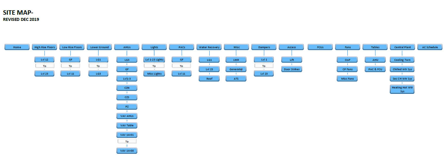
High-Rise Floor, Low-Rise Floor, Lower Ground Floor, Air Handling Units (AHUs), Lights, Packaged Air Conditioning Units (PACs), Lift Motor Room (LMR), Fan Coil Units (FCUs), Fans, Central Plant and Air Conditioning Schedule
Content Analysis, User Journey, Information Architecture
The rule “an effective user interface should be not more than three steps to get into what user wants to achieve" will still apply to this project, while designing the Site Structure on paper.
Site Structure will help me to visualise the Web Flow and Site Map that will serve as the reference guide to paper-prototyping and wireframing.
Client's requested this system to be accessible through iPad, on the other hand - Building Manager would normally access it through desktop, therefore, it's required to take into consideration both iPad and desktop platform when designing its UX UI.

Visual Research
Research on the colour, typography, graphic styling, web and device design was a challenge as this is my first BMS Project and on top of that, only a handful companies in Australia are in this industry.
However, with Engineering Manager's assistance, I managed to overcome the challenges. Some of the best samples from online resources were also collected. They all played important roles to define the style guide.
Style Guide
The style guide chosen is inline and harmonic with all visual research that had been done at the previous stage, this rule is applied to all colours, fonts, sprites, glyphs, icons, symbols and buttons in this project.
Primary colour would be the company logo's blue, while the secondary colour is black.
However, black colour was replaced by grey at the development stage later.
Grey is deemed to be the suitable match to the system theme. Another reason for blue colour chosen as primary colour is the company's core business - Heat Ventilation and Air Conditioning - which is associated with cool and/or air images.


